Information
Access to timely information is crucial before, during and after an emergency, it can save lives. It is also fundamental for delivering aid without discrimination and making sure that persons with disabilities have equal access.
Here are a few tips on making information accessible and more available for everyone:
- Consult with persons with disabilities or link up with Disabled People's Organisations on their preferred means of communication.
- Test the information with women, men and children with disabilities to understand the barriers to receive, process and understand information (blind people, people hard of hearing, people with psychosocial disabilities, or intellectual impairments). Include also people who cannot read or write and use the feedback to improve the information material and communication.
- Ensure that information material is made in multiple formats using different technologies, such as SMS, radio, TV, but also written information, billboards and through meetings or volunteers providing information house-to-house.
- Ensure that your information material is culturally sensitive and uses gender sensitive language and / or imagery. Too often women and girls with disabilities are neither represented, nor included.

Different resources and adaptations could be used to make material more accessible.
If using printed material:
- Use strong contrast colours;
- Use simple typeface (Arial, Calibri) and large font size (minimum 12) and provide a copy with drawings;
- Use large dark print (at least 10 cm letters for 3 m viewing distance/ 20 cm for 10 m distance).
- Make sure to provide large print versions of print materials.
If using audio material:
- Use audio signal for preparedness, street campaigns and sensitisations;
- It is preferable to have a larger number of quieter alarms rather than a few very loud ones, in order to achieve a more even distribution of the signal;
- Audio material should be combined with printed material.
If using electronic material
- Use strong contrast colours;
- Use large font (minimum 12), avoid italic font;
- Use closed captioning feature;
- Include option for enlarging text;
- Design an accessible website, see resource below.
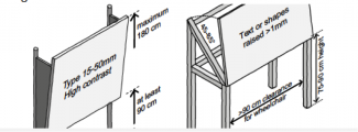
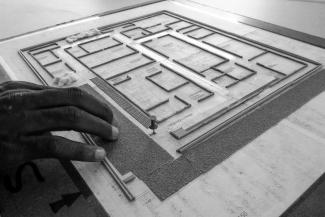
Information boards can be made more accessible if placing them in a height easily readable for a wheelchair user and younger children, 75-90 cm above the ground and maximum 180 cm high. Information can also be made using tactile maps, which can be read by persons with visual impairment.

